My man just graduated at the Danish Academy of Art, Design and Conservation here in Copenhagen.
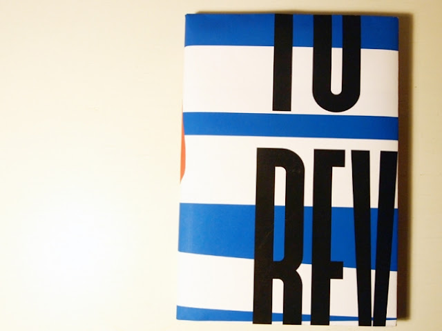
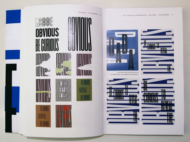
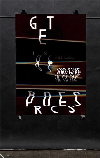
He has worked on a project where he has interpreted other graphic designers working methods and styles and with these tools created a series of posters and a publication which aim is to inspire other, younger graphic designers to try out new and different methods while working with graphic design.
It's a very diverse project that has taken him to many interesting fields within the history of graphic design within the 19th century - take a look at what he has created - because it is darn good !
10. Graphic Designers.
10. Typographic interpretations.
10. Inspiring sentences.
10. Different Design & Work philosophies.
10. Creative methods on creating ideas.
10. Innovative graphic styles.
The purpose of this project is to create a poster serie and a book, that will work as an inspiration source for other graphic designers and creative thinkers.
The book and poster serie should be seen as a study of 10 different known graphic designers, their methods, creative processes, inspirational sources and ideologies.
The 10 graphic designers studied in this project, are streching over several periods of the graphic design history, going from modernism, american advertising culture through the Pacific Wave movement, into the 1990s conceptual design aesthetics and ending up in the new millenium diving into the New Ugly and the eclectic design culture of today.
The aim of this study is to create a publication and a poster series that gives an insight into these designers working methods, design philosophies and style. Furthermore it is the intention that the publication and poster serie will give other creative thinkers an inspirational input and maybe create an interest in some of the featured designers or their working methods.
The posters created during this project are typographic interpretations of the 10 graphic designers and their work.
I find it relevant to use typography, and thereby show the possibities of type and how it can be used as an image. I strongly believe that this is a subject of graphic design where it is possible to substantiate a feeling/atmosphere and still get a message communicated out to a broader audience.
(Thomas Blankschøn - Made in school)
See more projects here
- The book -
- The posters -


